
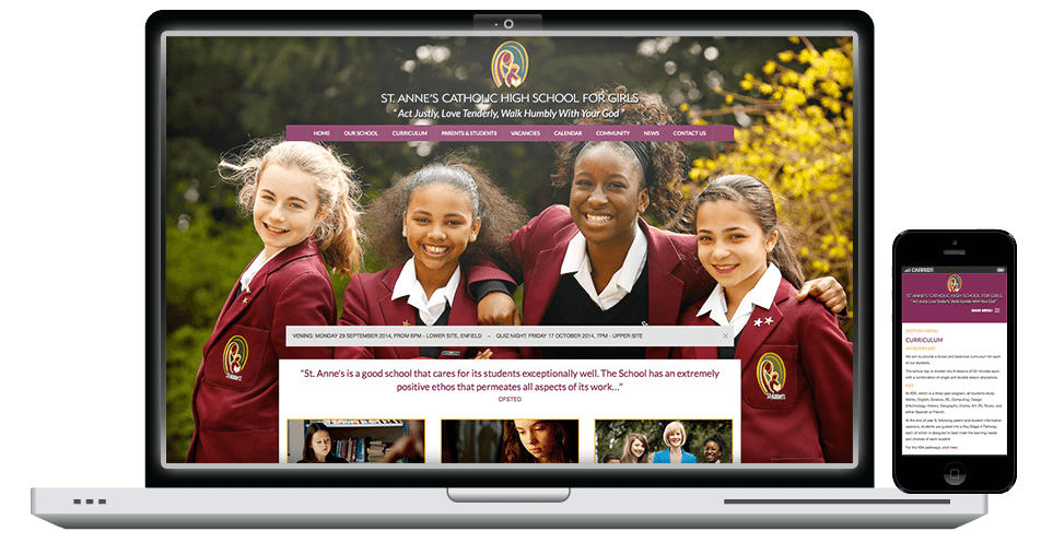
Now, you may try and ignore it, but the truth is mobile devices are a dominant force of technology and its probably about time your website adapted to the mobile world if it hasn’t done already! So how do you go about keeping up with this growing market of opportunity? Well luckily there’s a few solutions! You can make your website ‘responsive’ or ‘adaptive’ allowing you to give mobile and tablet users a great browsing experience just as they would on a desktop.
So which route should you take when thinking about getting your website redesigned - responsive or adaptive? Its important to note that whilst these methods do have some dissimilarities, they both prepare websites for mobile use on various screen sizes and devices, and so provide a better user experience for your customers.
More users are browsing the web on smartphones, tablets and notebooks as much these days as the ‘conventional’ desktop method – therefore it is essential for your website to possess fluidity, flexibility and practicality in navigation and design across the board, as there is now a greater stage for websites to perform on.

We love to go all in on responsive design here at Smart Cookie Design Ltd, allowing our work to be translated effectively and efficiently across a variety of screen sizes and mobile devices. The capability in fluid grid layouts allows a site to be appropriately scaled to fit browser windows, its resolution and screen size whilst keeping the content all in proportion to its original desktop format.
Adaptive websites work great if you know what type of device and screen size you are designing for. Like Responsive you can have your site running successfully through the many screen sizes available but you will probably find you have to manually design the correct layouts for this to be apparent. The downside of Adaptive sites is how they cope if a new screen size were to be released; the lack of fluidity in its design will leave you with a rigid and incompatible finished product.
So what direction should you take when thinking about having your website redesigned so it works on smaller devices too? Responsive websites are efficient in delivering polished and smooth functionality across all screen sizes and devices and though may take longer to put together; it definitely does pay off in the long-term. They are flexible enough to maintain themselves when moving across different devices whilst Adaptive sites will need to be maintained much more by a developer.
If your still unsure about how best to reach mobile and tablet users through your website, please get in touch with our team and we can happily walk you through the options available.